Mindful Gray vs. Agreeable Gray: Key Difference
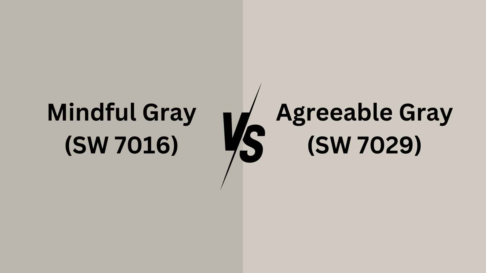
Are you torn between Agreeable Gray and Mindful Gray? I understand the challenge!
Choosing between Agreeable Gray and Mindful Gray can feel overwhelming when you’re creating your perfect space.
These versatile neutrals might look similar at first glance, but they create distinctly different moods in a room.
Understanding their unique undertones and how they coordinate with other colors is key to making the right choice.
In this blog, I’ll break down everything you need to know about these popular greige colors.
We’ll know their differences, the best-coordinating colors for each, and how to use them effectively in your home.
By the end, you’ll feel confident choosing the perfect gray for your space!
Basics of Mindful and Agreeable Gray Colors
Before discussing the differences, let’s discuss the grays we are talking about first:
Agreeable Gray (SW 7029)
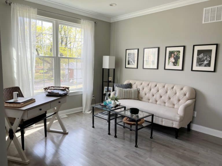
Agreeable Gray is a light-to-medium-toned greige with a perfect balance of warm and cool undertones.
It’s slightly warmer, making it bright enough for most spaces without appearing stark.
This versatile neutral adapts beautifully to different lighting conditions, appearing more beige in warm light and more gray in cool light.
Mindful Gray (SW 7016)
Mindful Gray is a medium-toned greige that leans slightly cooler than Agreeable Gray.
It’s noticeably deeper and creates more contrast on your walls.
Mindful Gray’s green undertones are the most recognizable, while any blue hue is so subtle that experts rarely mention it, though traces can occasionally appear in certain lighting conditions.
Comparison of Color Terminology
Here is a brief comparison between Agreeable Gray and Mindful Gray:
| Property | Agreeable Gray (SW 7029) | Mindful Gray (SW 7016) |
|---|---|---|
| LRV (Light Reflectance Value) | 60 | 48 |
| Color Category | Light, warm greige (gray + beige) | Warm gray with slight greige undertones |
| RGB Value | Red: 209, Green: 203, Blue: 193 | Red: 188, Green: 183, Blue: 173 |
| Hex Code | #D1CBC1 | #BCB7AD |
Undertones of Agreeable Gray
- Reige Undertones: A mix of gray and beige, making it a warm neutral.
- Subtle Green & Violet Hints: Can show faint green or violet undertones in different lighting.
- Warm in Bright Light: Appears more beige in warm, natural light.
- Cooler in Low Light: Looks grayer in rooms with less natural light.
- Versatile & Balanced: Adapts well to various spaces and decor styles.
Undertones of Mindful Gray
- Greige Base: A balanced mix of gray and beige, offering a warm yet neutral tone.
- Soft Green & Blue Hints: Can reveal subtle green or blue undertones depending on lighting.
- Warmer in Natural Light: Appears slightly beige and cozier in bright daylight.
- Cooler in Artificial Light: Tends to appear grayer in dim or cooler lighting conditions.
- Adaptable & Refined: Works well with a variety of color palettes and decor styles.
Agreeable and Mindful Grays in Interior
Sherwin-Williams’s popular gray paint colors offer distinct personalities for different rooms in your home.
Here’s how each shade performs across various living spaces to help you make the perfect choice.
Bedroom
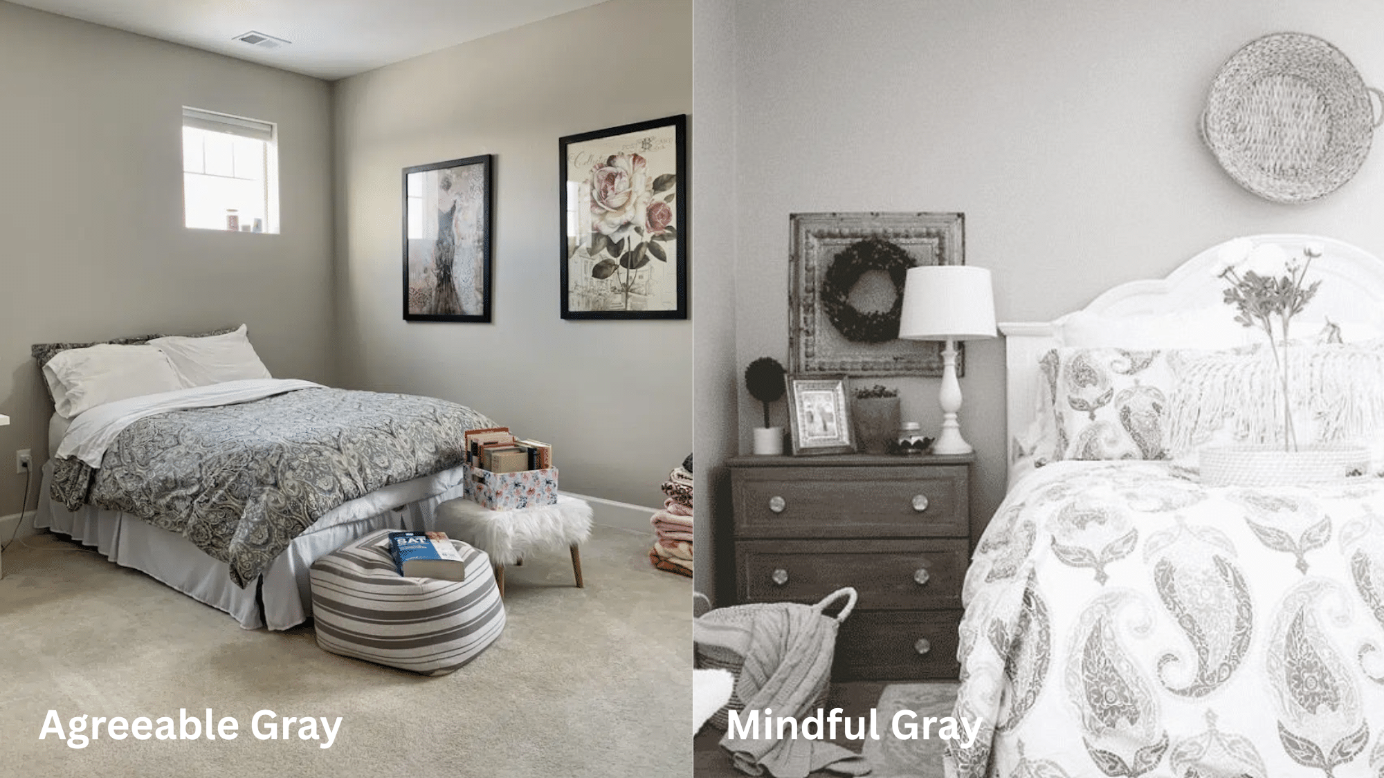
- Agreeable Gray: Creates a soft, restful vibe perfect for bedrooms. Its warm undertones promote relaxation while providing enough color to complement bedding and furniture without overwhelming the space.
- Mindful Gray: This offers a slightly deeper presence that can make larger bedrooms feel more intimate, which works beautifully against white trim and lighter bedding for a stylish contrast.
Bathroom
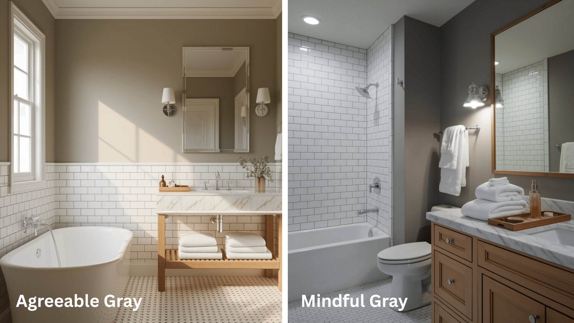
- Agreeable Gray: This color provides a clean, spa-like feeling while still offering warmth. It pairs excellently with white fixtures and marble surfaces.
- Mindful Gray: Creates more definition in bathrooms, particularly effective with chrome fixtures and white tile. The deeper tone helps anchor the space, especially in larger bathrooms.
Kitchen
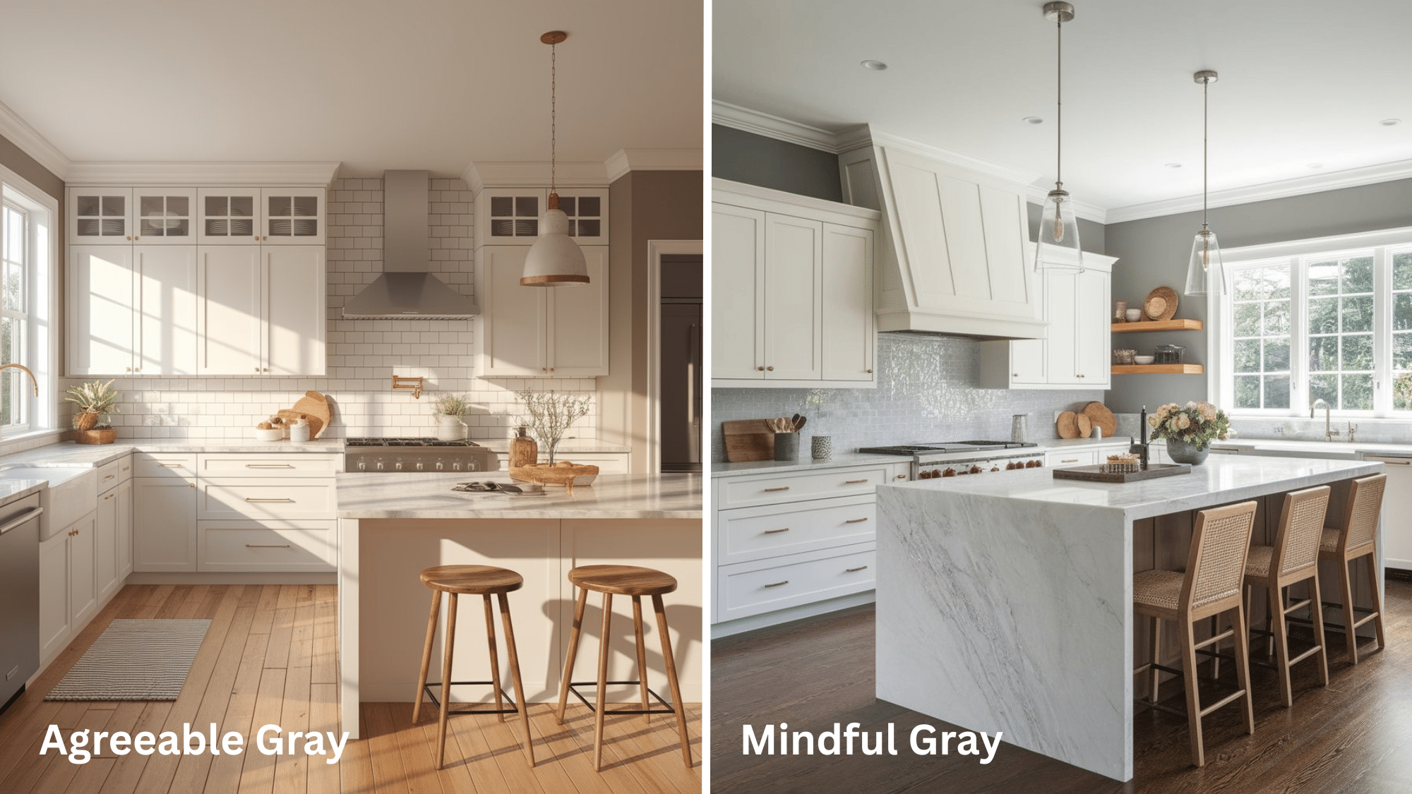
- Agreeable Gray: This gray offers versatility with various cabinet colors and countertop materials. Its chameleon-like quality works well with changing kitchen lighting throughout the day.
- Mindful Gray: Provides more visual weight in open-concept kitchens. Particularly striking with white cabinets or as an accent wall against lighter surfaces.
Living Room
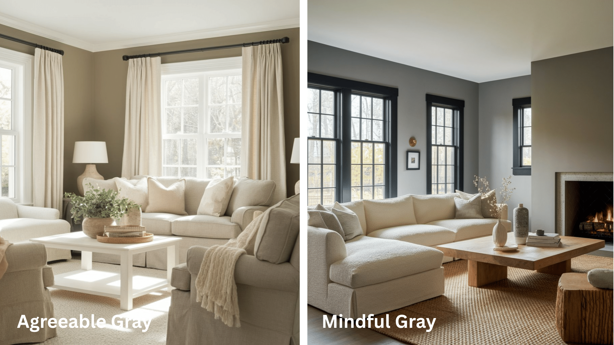
- Agreeable Gray: Creates a welcoming, adaptable backdrop that works with virtually any furniture style or color palette. Excellent for spaces that transition to other rooms.
- Mindful Gray: Delivers a more defined statement while remaining neutral. Creates a cozy atmosphere in larger living spaces and pairs beautifully with natural wood elements.
Similarities and Differences Between the Two Colors
While they both are different in shades, they both belong to the gray family & have some similarities:
| Feature | Agreeable Gray | Mindful Gray |
|---|---|---|
|
Color Family |
Warm greige (gray + beige) | Warm greige (gray + beige) |
|
Appearance in Bright Light |
Warmer and more beige | Slightly warm but grayer |
|
Appearance in Low Light |
Can appear slightly gray | Looks cooler and deeper |
|
Best For |
Smaller rooms, bright and open feel | Larger spaces, adds depth and moodiness |
|
Versatility |
Pairs well with warm and cool tones | Works well with both warm and cool accents |
|
Overall Tone |
Soft, warm, and inviting | Neutral, balanced, and slightly cooler |
Similar Colors Like Mindful and Agreeable Gray
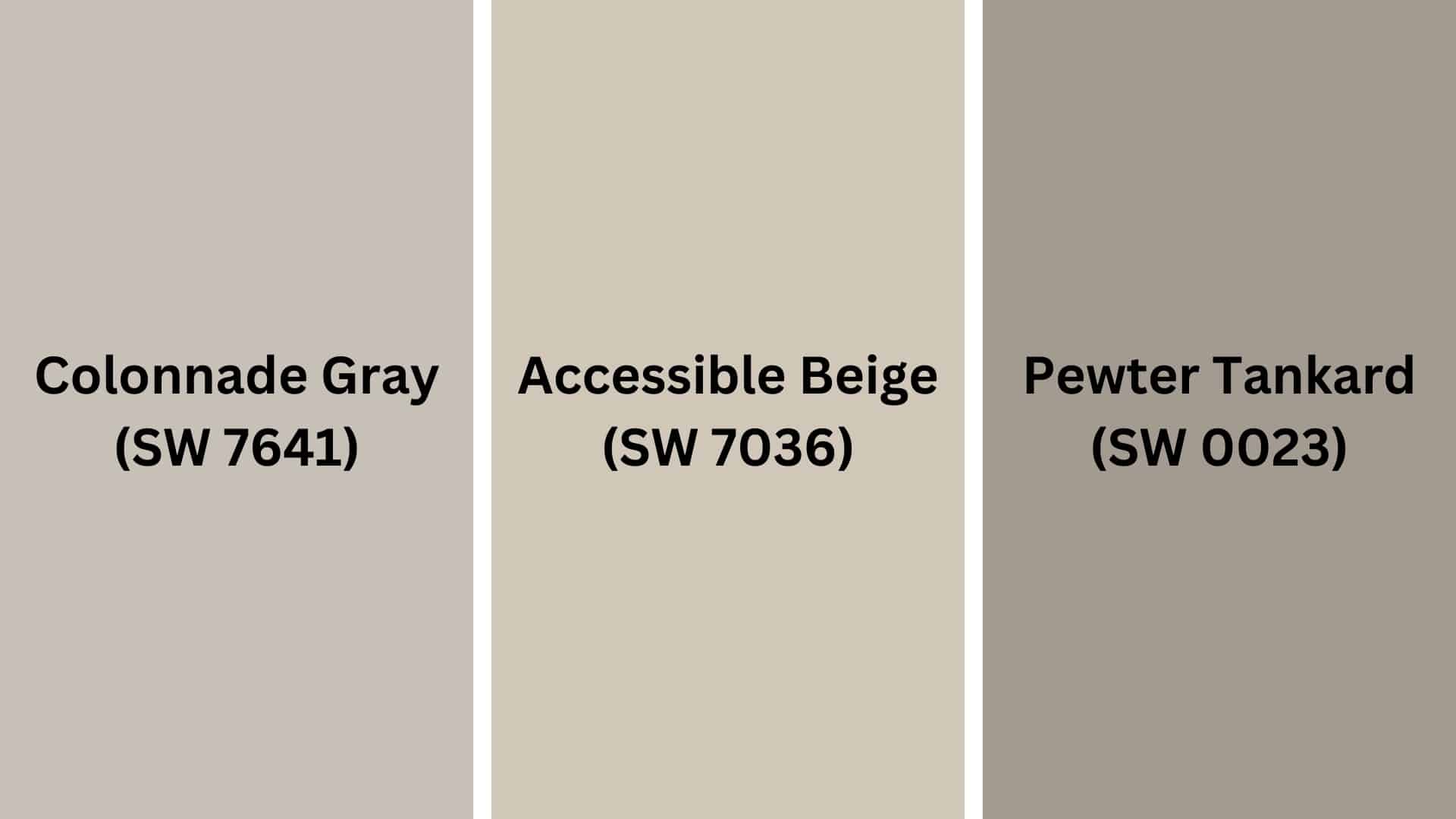
Here are some colors, which are somewhat similar to Mindful Gray and Agreeable Gray:
-
Accessible Beige (SW 7036): This warm beige-gray brings a cozy and inviting feel to any space. Its neutral tone makes it a great choice for creating a balanced look.
-
Colonnade Gray (SW 7641): With a well-balanced mix of gray and beige, this color provides warmth without overwhelming a space, which pairs effortlessly with various interior styles for a polished finish.
- Pewter Tankard (SW 0023): A rich, warm, darker gray with subtle brown undertones that adds completeness and depth, making it ideal for accent walls or cozy living spaces.
Color Scheme: Agreeable Gray vs. Mindful Gray
This table presents a side-by-side comparison of how each color pairs with warm, cool, and monochromatic schemes.
Monochromatic Scheme
| Element | Agreeable Gray (SW 7029) | Mindful Gray (SW 7016) |
|---|---|---|
| Main Walls | Agreeable Gray (SW 7029) | Mindful Gray (SW 7016) |
| Trim | Pure White (SW 7005) | Snowbound (SW 7004) |
| Ceilings | Toque White (SW 7003) | Eider White (SW 7014) |
| Accents | Anew Gray (SW 7030) | Dorian Gray (SW 7017) |
Warm Color Scheme
| Element | Agreeable Gray (SW 7029) | Mindful Gray (SW 7016) |
|---|---|---|
| Main Living | Agreeable Gray (SW 7029) | Mindful Gray (SW 7016) |
| Dining | Accessible Beige (SW 7036) | Balanced Beige (SW 7037) |
| Hallways | Whole Wheat (SW 6121) | Nomadic Desert (SW 6107) |
| Bedrooms | Soft Suede (SW 9577) | Mega Greige (SW 7031) |
Cool Color Scheme
| Element | Agreeable Gray (SW 7029) | Mindful Gray (SW 7016) |
|---|---|---|
| Main Walls | Agreeable Gray (SW 7029) | Mindful Gray (SW 7016) |
| Bathrooms | Repose Gray (SW 7015) | Passive (SW 7064) |
| Bedrooms | Sea Salt (SW 6204) | Silver Strand (SW 7057) |
| Home Office | Morning Fog (SW 6255) | Storm Cloud (SW 6249) |
Common Mistakes to Avoid
When using Agreeable Gray or Mindful Gray, it’s important to consider factors like lighting, undertones, and surrounding decor.
Avoid these common mistakes to ensure the best results in your space.
For Agreeable Gray
- Ignoring Lighting Conditions: Agreeable Gray can appear almost beige in south-facing rooms with warm light. Always test in your specific lighting before committing.
- Not Considering Adjacent Spaces: This chameleon-like color changes in response to its surroundings. Consider how it will flow with connected rooms.
- Using in Extremely Dark Spaces: Without adequate lighting, Agreeable Gray can look flat and muddy rather than showing its subtle warmth.
- Pairing With Cool Whites: Its greige undertones clash with stark, cool whites. Choose complementary warm whites for trim and ceilings.
- Expecting It to Look Like Online Photos: Monitor colors vary drastically. Always use physical samples in your space.
For Mindful Gray
- Using It in Already Dark Rooms: As a medium-depth gray, it can make small or poorly lit spaces feel closed in and heavy.
- Inconsistent Lighting Evaluation: Mindful Gray exhibits a significant shift in appearance from morning to evening light. Test at different times before deciding.
- Pairing With Competing Undertones: Its warm undertones can clash with cool-toned furnishings or flooring.
- Not Considering Room Size: In smaller spaces, this deeper gray can overwhelm if used on all walls.
- Failing to Adjust for Regional Light: Northern light makes it appear cooler, while southern exposure brings out its warmth. Regional light quality matters tremendously.
Final Notes
Mindful Gray and Agreeable Gray are both popular Sherwin-Williams gray paints, but they offer different effects in your space.
Mindful Gray works well in spaces with lots of natural light or where you want a more defined gray look.
Agreeable Gray is perfect for rooms where you want a subtle neutral that adapts to changing light throughout the day without appearing too cool or stark.
Both offer excellent coverage and durability, but your choice ultimately depends on your needs.
Ready to change your home? Get sample pots of both colors today to test how they look in your specific lighting!

