Everything You Should Know About Agreeable Gray Explained

Do you want a home that feels calm, clean, and easy to decorate? Agreeable Gray by Sherwin-Williams is a color that works almost anywhere.
It looks warm or cool depending on the light, which makes it easy to match with other colors.
Many people use it on walls, trim, or even furniture for a timeless look.
What makes this color truly special is its chameleon-like ability to coordinate with countless other colors.
We will help you find the perfect coordinating colors for Agreeable Gray, plus simple design tips and color pairings to try at home.
Understanding the Agreeable Gray Color
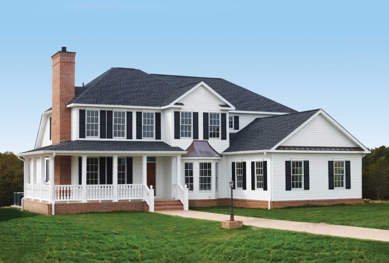
Agreeable Gray (SW 7029) sits perfectly between beige and gray, creating what designers call a “greige”, a warm gray that works beautifully in almost any space.
1. Color Terminology
Here are some basics about Agreeable Gray, from the official website of Sherwin-Williams.
| Property | Value |
|---|---|
| LRV (Light Reflectance Value) | 60 |
| Color Category | Light, Warm Greige |
| Comparison | Pure White: ~90 LRV, Black: ~0 LRV |
| RGB Value | Red: 209, Green: 203, Blue: 193 |
| Hex Code | #D1CBC1 |
2. Undertones
Understanding about undertones of Agreeable Gray will help you understand the color more efficiently.
- Reige Undertones: A mix of gray and beige, making it a warm neutral.
- Subtle Green & Violet Hints: Can show faint green or violet undertones in different lighting.
- Warm in Bright Light: Appears more beige in warm, natural light.
- Cooler in Low Light: Looks grayer in rooms with less natural light.
- Versatile & Balanced: Adapts well to various spaces and decor styles.
3. Psychology of Gray Colors
Understanding the psychological effects of gray tones can help you create interiors that bring the perfect mood while maintaining stylish appeal.
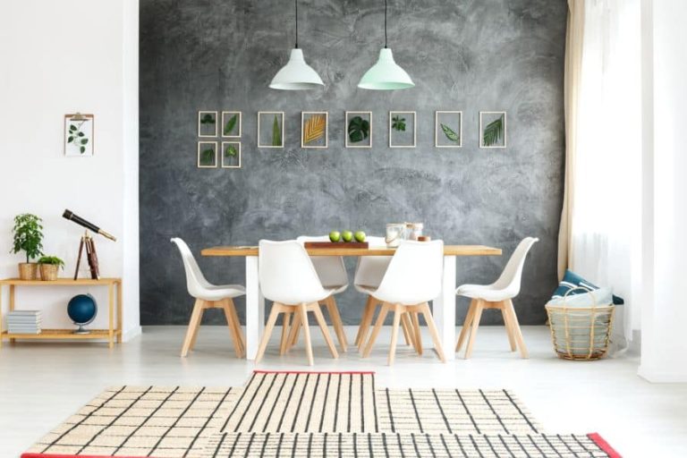
- Gray paired with soft blues creates a calming, peaceful atmosphere, making it ideal for bedrooms and relaxation spaces.
- Combining gray with muted greens promotes balance and a refreshing feeling, perfect for areas meant to foster tranquility.
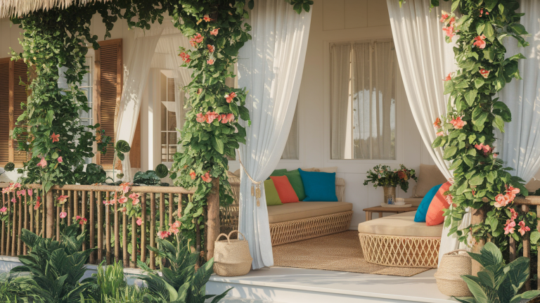
- Warm coral or peach accents alongside gray introduce energy and warmth, infusing living and social spaces with vitality.
- Darker grays mixed with strong navy or charcoal tones bring completeness and a grounded, focused environment, suitable for offices or formal rooms.
- Light creams and whites paired with gray enhance a sense of cleanliness and openness, great for kitchens and bathrooms.
- Adding blush or soft pink hues to gray tones can bring a sense of comfort and gentle warmth, creating inviting and cozy areas.
Gray Colours in Interiors
Gray is a stylish and flexible color that suits any home. Depending on the shade, it can create a cozy, warm feel or a sleek, modern look.
Whether used on walls, furniture, or decor, gray blends well with other colors, making it perfect for any interior style.
Here are some of the ideas for the interior design you might like:
1. Bedroom
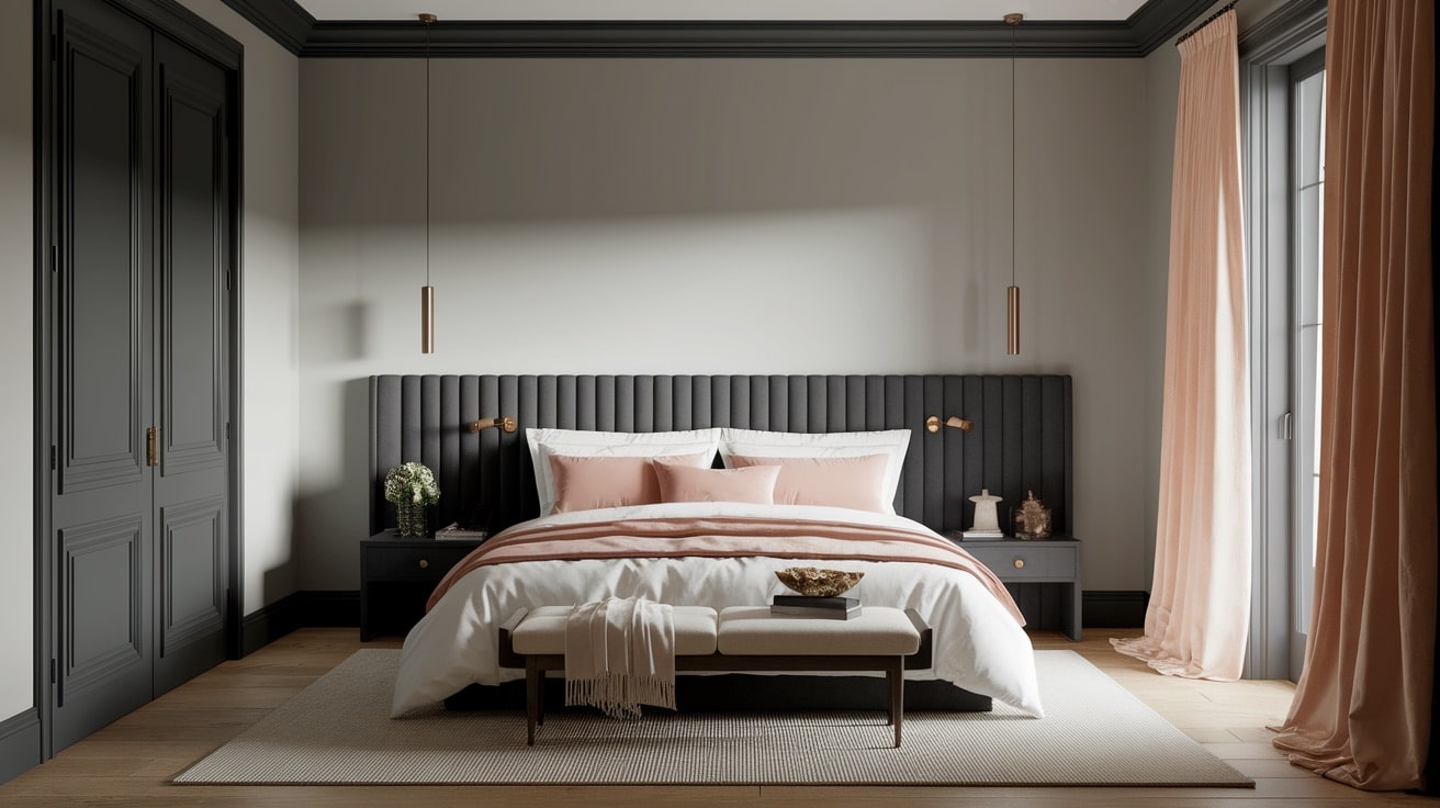
Gray bedrooms offer a peaceful and relaxing atmosphere, making them perfect for rest. Whether you prefer a light, airy feel or a darker, cozier vibe, gray adapts beautifully.
- Soft gray walls create a calming and cozy space.
- Dark charcoal accents add depth and drama to the space.
- Pairing gray with warm whites or blush tones adds warmth.
- Gray bedding and curtains bring a modern touch.
- Wood or metallic finishes complement gray for a balanced look.
2. Bathroom
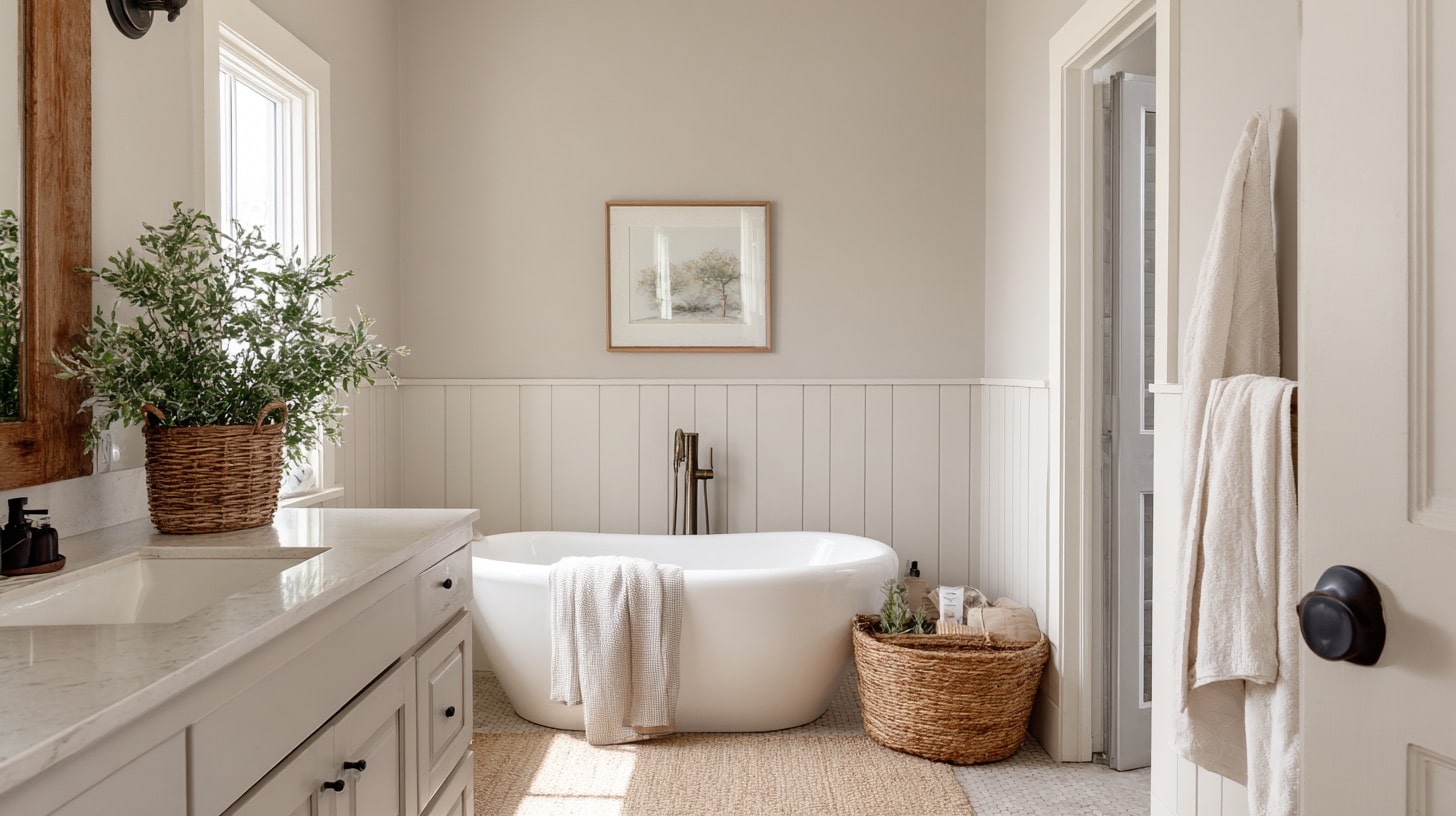
A gray bathroom feels modern and spa-like, offering a clean and refreshing vibe. It pairs well with both light and dark elements for a stylish contrast.
- Light gray tiles give a fresh and airy feel.
- Dark gray vanities create a bold and sleek statement.
- Marble with gray veining adds a luxurious touch.
- Gray walls contrast beautifully with white fixtures.
- Matte black or gold hardware increases the gray theme.
3. Kitchen
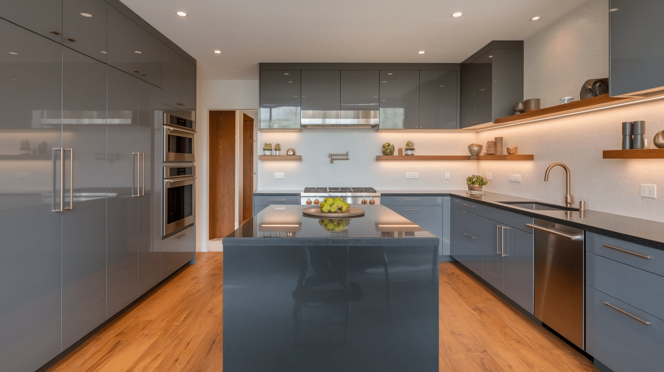
Gray kitchens are timeless, working well with both modern and traditional designs. The right shade of gray can make the kitchen feel warm and inviting.
- Gray cabinets give a sleek and polished look.
- Light gray walls make the space feel open and airy.
- Dark gray islands add depth and contrast.
- Pairing gray with wood tones adds warmth and texture.
- Stainless steel appliances complement gray beautifully.
4. Living Room
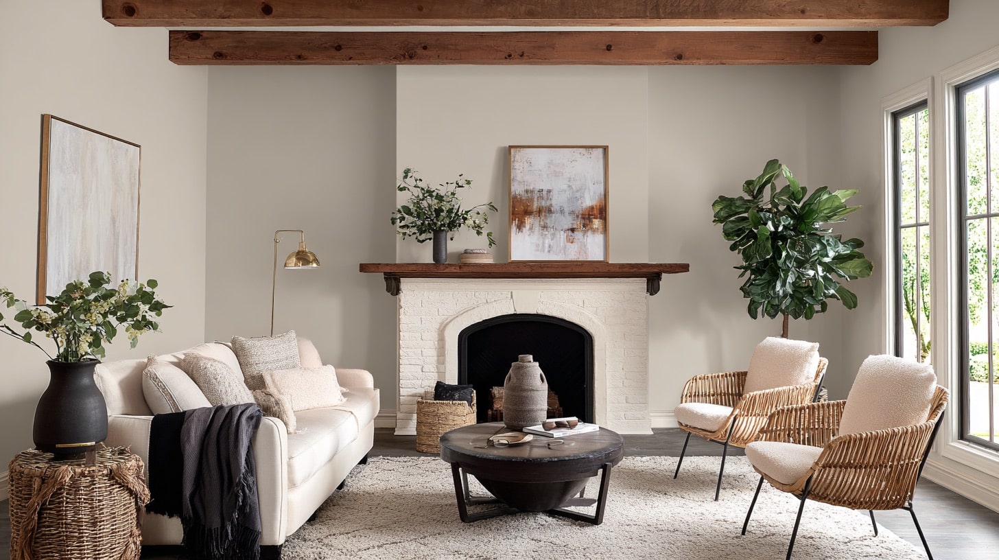
A gray living room is versatile and simple, serving as a perfect backdrop for various styles and decor. It can be cozy and warm or chic and modern.
- Light gray walls keep the space bright and neutral.
- Dark gray sofas create a stylish and cozy focal point.
- Gray rugs add texture and tie the room together.
- Accent colors like mustard or navy add a pop of personality.
- Mixing gray with natural elements like wood softens the look.
List of Coordinating Colors
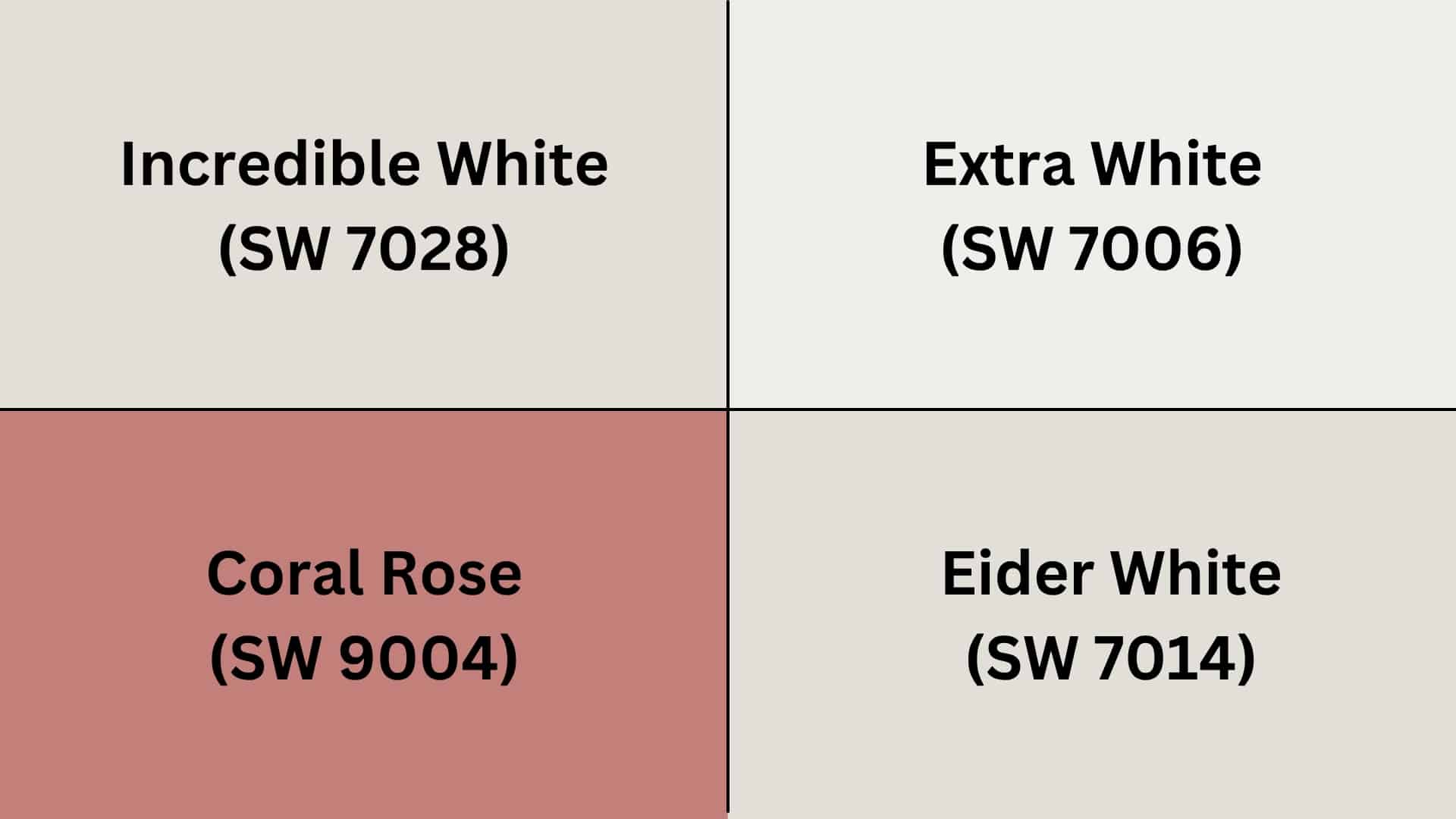
Choosing the right coordinating colors increases the beauty of Agreeable Gray, creating a well-balanced and stylish space.
Here are some excellent color pairings that complement its warm tones.
- Incredible White (SW 7028): This soft off-white carries subtle warmth, making it perfect for creating a light and airy feel in any space.
- Extra White (SW 7006): Crisp and clean, this bright white adds a fresh, modern touch, ideal for trim and ceilings.
- Eider White (SW7014): Soft and smooth color, this lively coral shade injects warmth and energy into any room.
- Coral Rose (SW 9004):This pink-orange shade adds warmth when used with Agreeable Gray. It brings a pop of color that makes gray walls look more interesting.
Creating a Cohesive Color Scheme
Agreeable Gray (SW 7029) provides a soft, inviting backdrop that pairs beautifully with both warm and cool colors. Here are some of the colour schemes you might like.
| Monochromatic Scheme | Warm Color Scheme | Cool Color Scheme |
|---|---|---|
| Agreeable Gray (SW 7029) – Walls | Agreeable Gray (SW 7029) – Living Areas | Agreeable Gray (SW 7029) – Walls |
| Pure White (SW 7005) – Trim | Accessible Beige (SW 7036) – Dining Room | Repose Gray (SW 7015) – Bathrooms |
| Toque White (SW 7003) – Ceilings | Whole Wheat (SW 6121) – Hallways | Sea Salt (SW 6204) – Bedrooms |
| Anew Gray (SW 7030) – Accents/Adj. | Soft Suede (SW 9577) – Bedrooms | Morning Fog (SW 6255) – Home Office |
These coordinating colors show the gray’s natural warmth and adaptability.
Whether you prefer a monochromatic, warm, or cool palette, this shade ensures a timeless flow throughout your home.
Tips For Choosing the Right Coordinating Colors
When selecting colors to pair with Agreeable Gray, consider these helpful guidelines:
- Assess Your Lighting First: Agreeable Gray appears warmer in south-facing rooms and cooler in north-facing spaces, which affects how coordinating colors will look.
- Test Samples in Your Actual Space: Paint large swatches or use peel-and-stick samples to see how colors interact with your specific lighting and existing elements.
- Consider the Mood You Want to Create: For a calming space, pair with soft blues or greens. For energy, consider coral or navy accents.
- Maintain Contrast for Visual Interest: Include both lighter (whites, creams) and darker elements (charcoal, navy) to create depth.
- Use the 60-30-10 Rule: 60% Agreeable Gray, 30% secondary color, and 10% accent color for a balanced look.
- Don’t Forget Existing Elements: Consider your flooring, cabinetry, and fixtures when choosing coordinating colors.
- Create Flow with Color Relationships: Colors that share undertones will create a harmonious feel throughout your home.
Choosing the right colors will help you enhance your main color, Agreeable Gray, even better.
Common Mistakes to Avoid
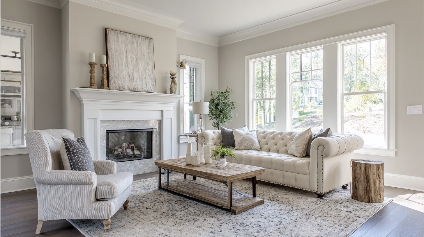
Choosing the right complementary colors for Agreeable Gray can enhance your interior design, but a few common missteps might diminish its natural versatility and charm.
- Failing to test colors in different lighting conditions can cause unexpected color shifts and clashes with Agreeable Gray’s undertones.
- Overusing colors that are too similar in tone leads to a lack of contrast and making spaces appear flat or uninspired.
- Ignoring existing design elements like flooring, cabinetry, or furnishings can result in color conflicts and inconsistent overall styles.
- Neglecting the difference between natural and artificial lighting can cause colors to appear differently and affect the mood of the room.
- Disregarding the balance between warm and cool undertones, disrupting the harmonious flow that Agreeable Gray naturally supports.
By being mindful of these pitfalls, you can leverage Agreeable Gray’s adaptability to design spaces that feel harmonious, stylish, and thoughtfully composed.
The Bottom Line
Agreeable Gray stands as one of the most neutral paint colors available today. Its a balanced blend of warm and cool undertones that creates a timeless backdrop for any home.
By selecting the right coordinating colors, you can change your Agreeable Gray spaces from pleasant to exceptional. This neutral color adapts beautifully to different lighting and design styles.
If you’re seeking a color that brings calmness without sacrificing style, Agreeable Gray deserves your attention.
Ready to change your space with the perfect Agreeable Gray palette?
Grab some sample pots today and see this remarkable neutral in action! Your designer-worthy home is just a brushstroke away.

