Top 11 Colors Combos that Go with Golden Oak Wood
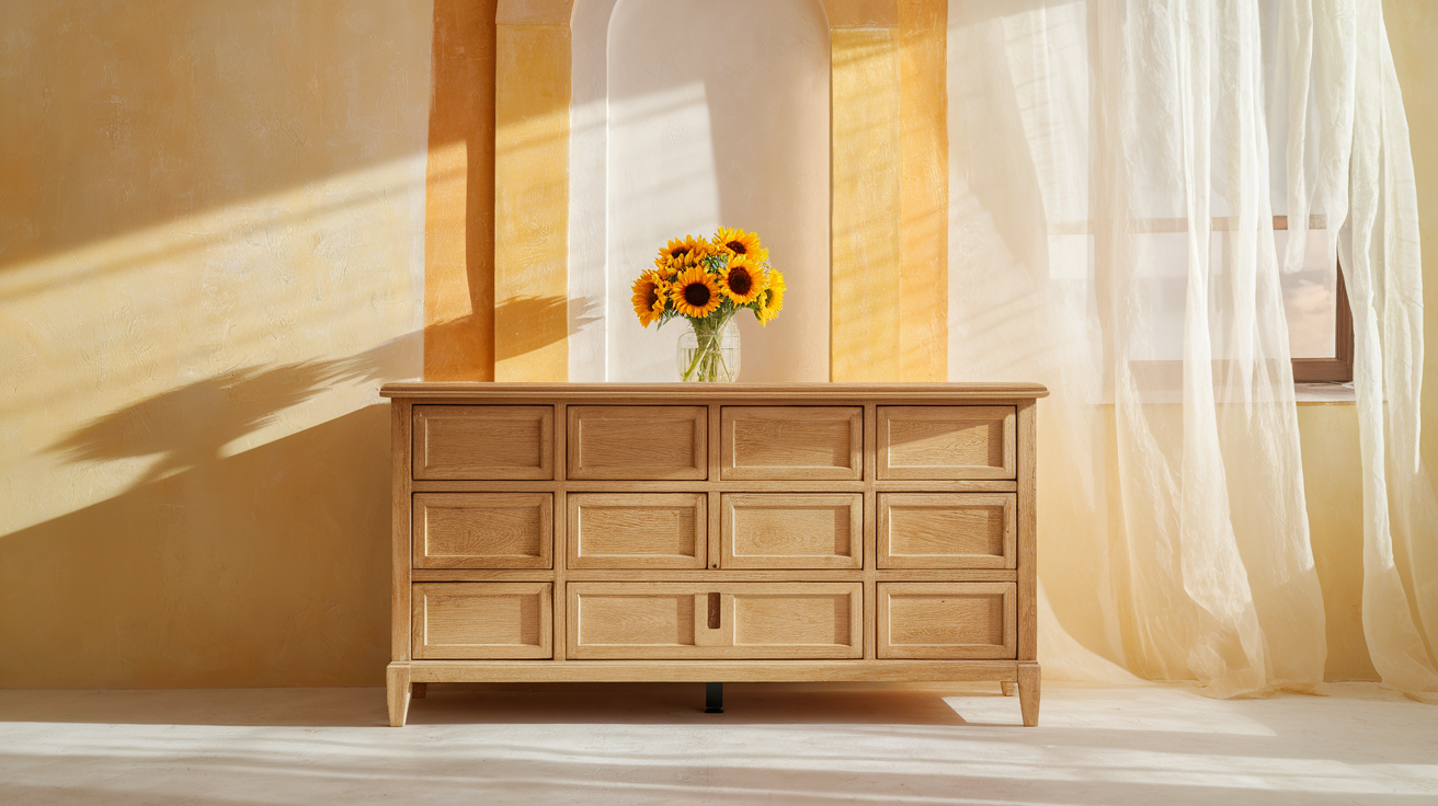
Golden oak wood, with its warm honey tones and distinct grain pattern, creates a timeless base for any space.
However, finding the right color combinations to match this classic wood finish can be tough. When working with golden oak cabinets, furniture, or other wood elements, the right colors can change your room from dated to fresh.
In this guide, you’ll find color combinations that work well with golden oak wood.
From cool neutrals that balance oak’s warmth to bold accent colors that create eye-catching contrasts, these pairings will help you make the most of your golden oak features while creating a pulled-together, modern look in your home.
Colors That Perfectly Match Golden Oak Wood
Golden oak wood features warm, honeyed tones that can be paired beautifully with the following colors:
1. Sage Green
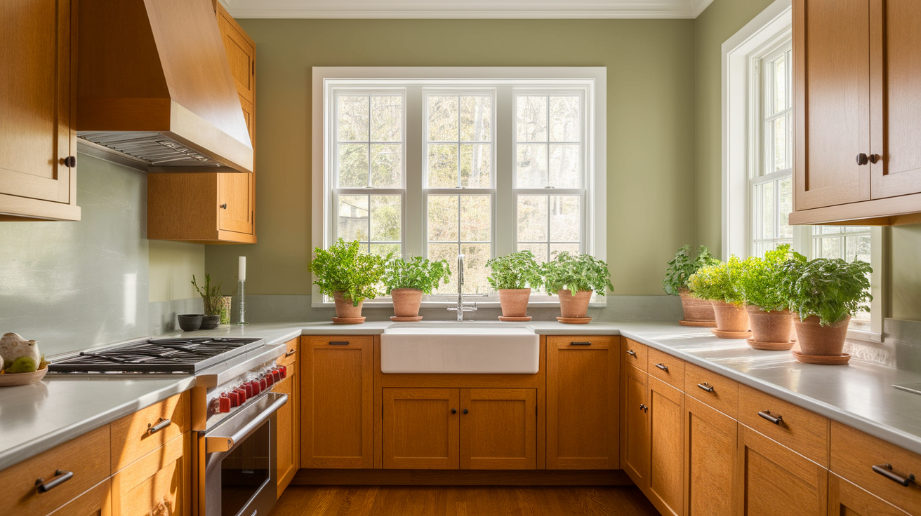
Sage green offers a calm, natural pairing with golden oak wood. This soft, muted green brings out the warm undertones in oak while adding a touch of nature to your space.
This pairing works particularly well because sage green contains gray undertones that temper oak’s warmth without dulling its natural glow.
Sage green upholstery or walls help oak furniture pieces look intentional in living spaces. The color also works beautifully in bedrooms with oak bed frames, creating a restful retreat.
- Why it works: Sage’s earthy quality balances golden oak’s yellow-orange tones, creating a peaceful, grounded feeling in any room.
- Best used in: Kitchens with oak cabinets, living rooms with oak furniture, or as an accent wall behind oak shelving. Sage green paint on walls surrounding oak kitchen cabinets creates a garden-fresh feeling.
2. Navy Blue
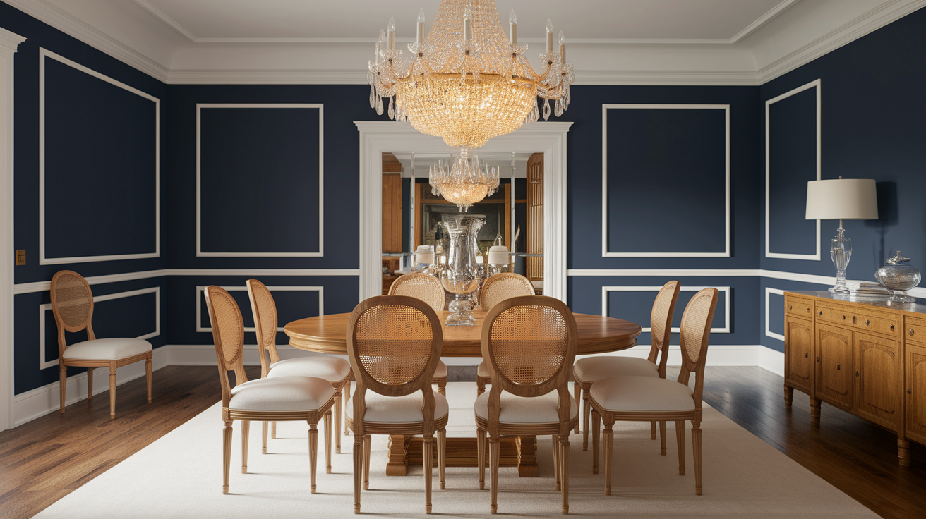
Navy blue creates a strong, classic contrast that helps modernize golden oak without fighting against it.
This high-contrast pairing creates visual interest, while the traditional nature of both colors ensures they work harmoniously together.
Navy blue walls in a dining room with an oak table create a dramatic entertaining space. In a home office, navy blue built-ins or walls make oak desks look stately and important.
- Why it works: The Navy’s deep, cool tone serves as a perfect background, allowing oak’s warm glow to stand out rather than appear dated.
- Best used in: Dining rooms with oak tables, home offices with oak desks, or as throw pillows and rugs in rooms with oak floors.
3. Creamy White
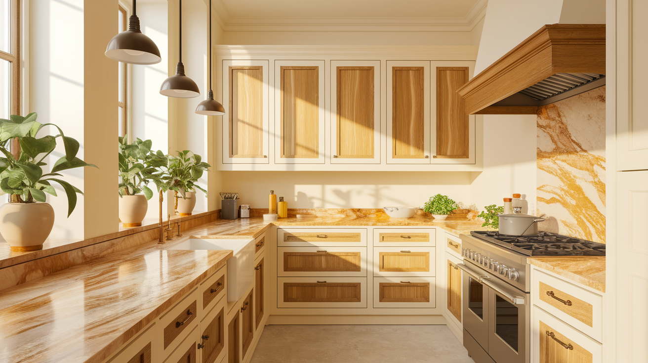
A soft, creamy white offers a clean but warm backdrop that lets golden oak shine without competing with it.
Unlike stark whites, which can create a jarring contrast, creamy whites have a subtle warmth that complements the natural honey tones of oak.
This creates a soft, cohesive look that feels bright and open while still maintaining visual warmth. The combination works in both traditional and contemporary spaces, giving oak a fresh context without competing with its natural color.
In kitchens, creamy white walls, backsplashes, or countertops create a light and bright space that complements oak cabinets. In bathrooms, creamy white tiles and fixtures soften the look of oak vanities.
- Why it works: Unlike stark whites that can make oak look orange, creamy whites have subtle yellow undertones that match oak’s warmth.
- Best used in: Throughout the home as a neutral base color, especially in kitchens, bathrooms, and hallways with oak elements.
4. Warm Gray
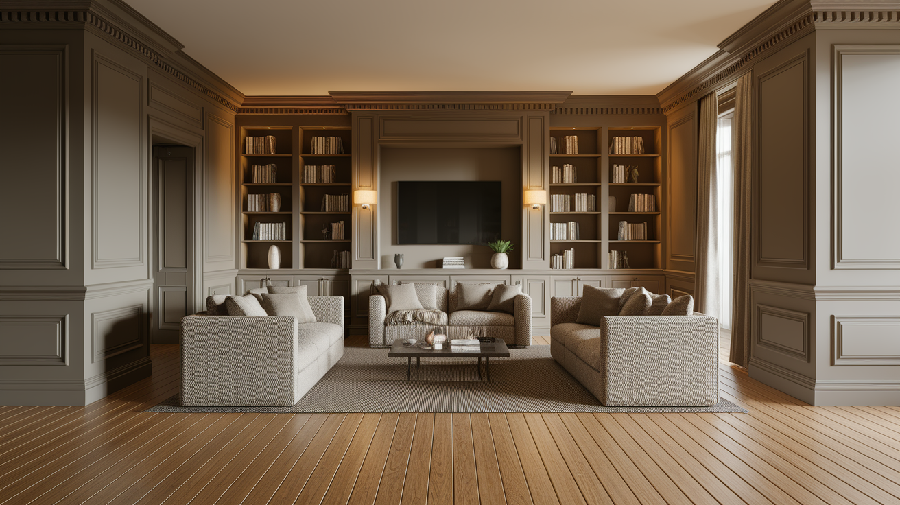
Warm gray (sometimes called “greige”) provides a current, neutral backdrop that helps oak look purposeful rather than outdated.
It’s neutral enough to be contemporary but has enough warmth to prevent a jarring contrast with golden oak. This combination feels beautiful and intentional, making oak elements look chosen rather than inherited.
This chameleon-like color bridges traditional and contemporary styles, helping golden oak fit into modern design schemes.
Because of its versatility, warm gray works well as a connecting color throughout homes with varying amounts of oak elements, creating visual consistency from room to room.
- Why it works: The mix of gray with beige undertones bridges the gap between cool modern colors and warm traditional woods.
- Best used in: Living spaces, bedrooms, and as a whole-house color that ties together rooms with oak features. In living rooms, warm gray walls make oak trim and furniture look grounded and purposeful.
5. Terracotta
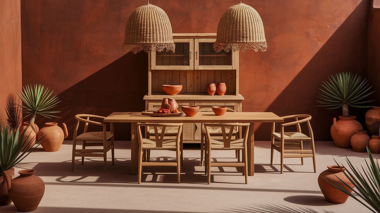
When paired with golden oak, this rich, earthy red-orange tone creates a cozy, southwestern feel. The clay-like color adds depth and warmth, creating spaces that feel welcoming and grounded.
Rather than competing with oak’s warmth, it beautifies and increases it, creating a sunset-like glow in the space.
In kitchens, terracotta tile backsplashes pair beautifully with oak cabinets. For a less permanent approach, incorporate terracotta through pottery, throw blankets, pillows, and artwork in rooms with significant oak elements.
- Why it works: Terracotta sits near golden oak on the color wheel, creating a rich, warm space that feels planned and pulled together.
- Best used in: Accent walls, kitchen backsplashes, or as a decorative accent through textiles and pottery in rooms with oak features. A terracotta accent wall behind an oak bed creates a striking focal point.
6. Slate Blue
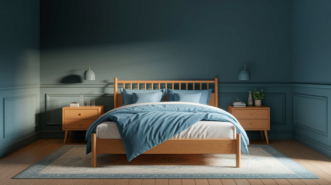
Slate blue provides a cool, soothing counterpoint to the golden oak’s warmth without being too stark or cold. This muted, gray-tinted blue creates depth and interest while still allowing oak features to take center stage.
The color adds subtle contrast without creating a jarring effect, and its muted quality helps update spaces with oak elements without making them feel too trendy or specific to one time period.
- Why it works: The gray undertones in slate blue help bridge the gap between cool and warm colors, making it a good middle ground when working with golden oak.
- Best used in: Bedrooms with oak furniture, bathrooms with oak vanities, or living spaces with oak flooring. In bedrooms, slate blue creates a restful atmosphere while complementing oak bed frames and dressers.
7. Olive Green
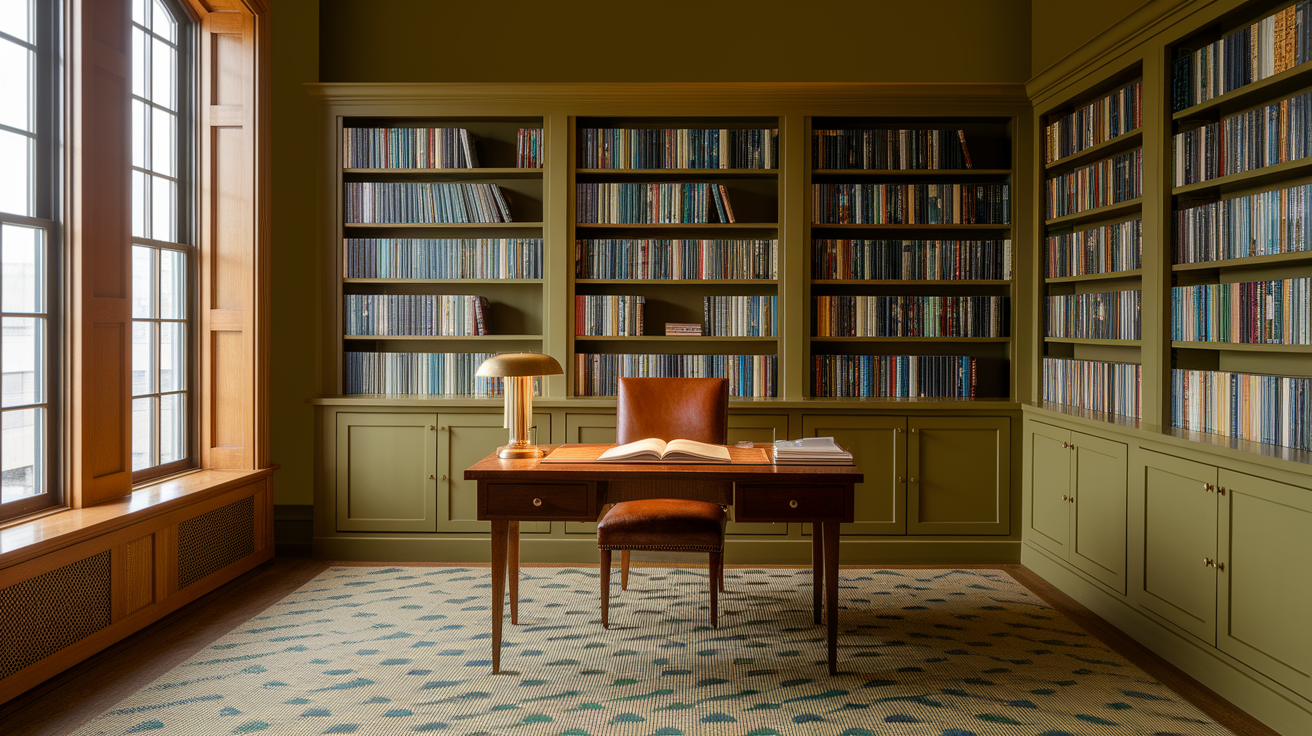
Olive green creates a natural, timeless pairing with golden oak that feels both classic and current. This rich, muted green has enough yellow undertones to harmonize with oak while still providing a gentle contrast.
The yellow undertones in olive green echo the warmth in golden oak, creating a subtle harmony, while the green itself provides enough difference to create visual interest and depth.
An olive-green accent wall behind oak bookshelves creates a stylish backdrop for books and objects. In dining spaces, olive-green upholstery pairs beautifully with oak tables.
- Why it works: Both colors have natural, organic qualities that work together to create spaces that feel grounded and connected to nature.
- Oak furniture is best used in Studies or home offices, dining rooms with oak tables, or as accent pieces in spaces with oak flooring or trim.
8. Soft Black
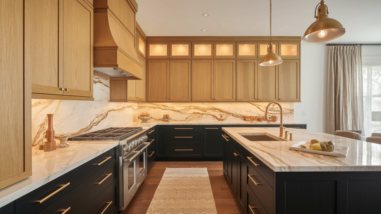
Soft black (sometimes called “off-black” or “charcoal”) creates a dramatic contrast with golden oak, which feels modern yet timeless.
The depth in soft black has a fragile quality that upgrades the look of oak rather than making it appear dated. This combination effectively bridges traditional and contemporary styles.
Unlike true black, these slightly muted dark tones have depth that pairs more harmoniously with natural wood.
A soft black island creates a striking centerpiece in a kitchen with oak cabinets. As an accent wall, it can showcase oak furniture pieces. Soft black exterior paint makes oak doors and windows pop, creating excellent curb appeal.
- Why it works: The high contrast between light golden oak and soft black creates visual drama, helping oak elements stand out as focal points.
- Best used in Kitchen islands paired with oak cabinets, accent walls in rooms with oak furniture, and exterior paint for homes with oak doors or interior trim.
9. Warm Taupe
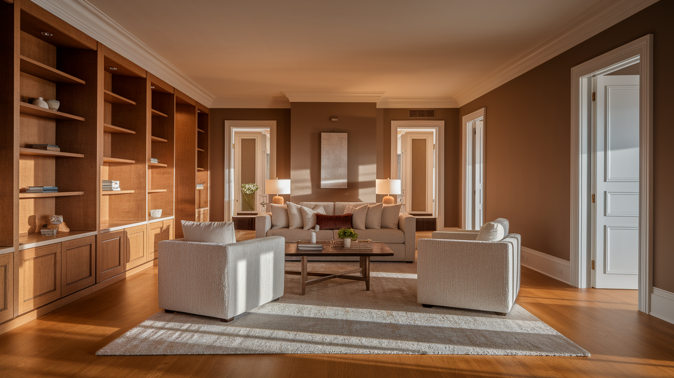
Warm taupe provides a neutral backdrop that enhances golden oak without competing with it. This versatile color has both warm and cool properties that help it work with oak’s natural warmth while still feeling current.
This balanced neutral acts as a bridge between golden oak and other design elements, allowing for greater flexibility with accent colors and styles. The result is spaces that feel cohesive, calm, and current.
Taupe walls in living rooms create a soft backdrop that makes oak trim and furniture feel intentional. In hallways, taupe helps connect spaces with oak elements smoothly.
- Why it works: Taupe’s warm undertones complement oak’s honey color, while its gray properties help modernize spaces with oak elements.
- Best used in: Oak furniture or trim is best used in living rooms, hallways connecting spaces with oak elements, and bedrooms.
10. Burgundy
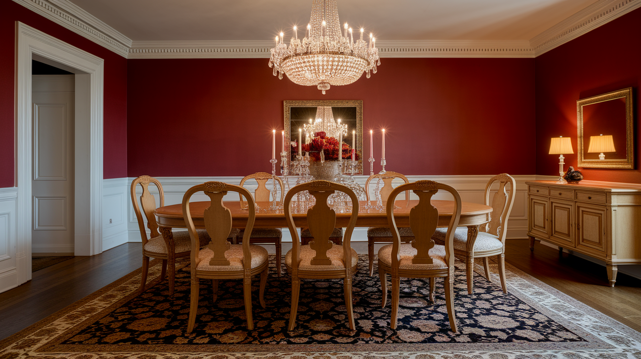
Burgundy creates a rich, traditional pairing with golden oak that feels warm and inviting. This deep, sophisticated red adds depth and drama while complementing the oak’s natural warmth.
This classic color combination has timeless appeal and works particularly well in traditional or vintage-inspired spaces. The depth of burgundy helps ground spaces with lighter oak elements.
Burgundy walls in dining rooms create dramatic, intimate spaces for entertaining. The combination feels scholarly and rich in home offices or libraries.
- Why it works: Burgundy’s red undertones boost the yellow-orange qualities of golden oak, creating a warm, glowing effect.
- Best used in: Dining rooms with oak tables and chairs, libraries or studies with oak shelving, or through textiles in living spaces with oak features.
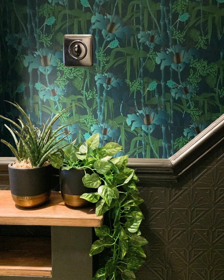
11. Muted Teal
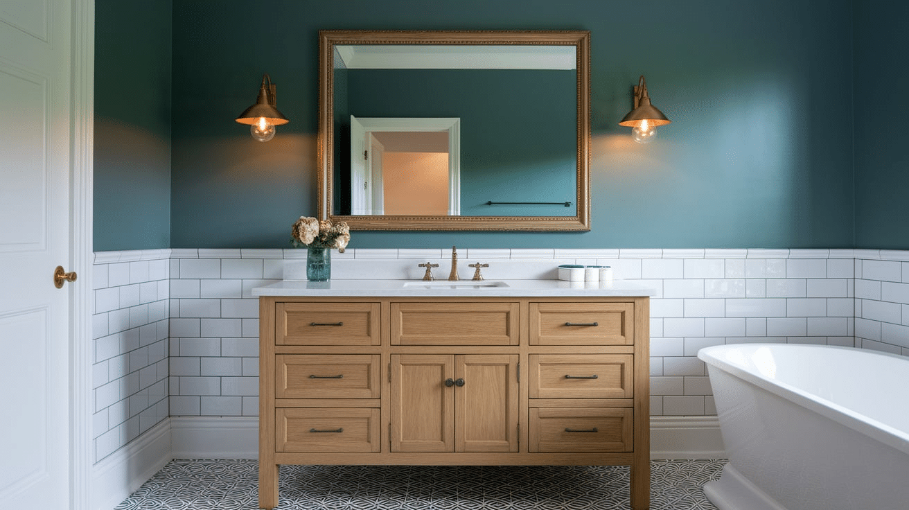
Muted teal offers a balanced blue-green tone that contrasts beautifully with golden oak while still feeling harmonious. This versatile color has enough gray to feel polished rather than overly bright or trendy.
The muted quality ensures the combination isn’t too jarring. This pairing helps oak feel current and purposeful while adding personality to a space.
Teal walls or tile in bathrooms complement oak vanities beautifully. In bedrooms, teal creates a restful yet interesting backdrop for oak furniture.
- Why it works: Teal’s blue-green color sits opposite orange-yellow on the color wheel, creating a natural contrast with golden oak that feels lively yet balanced.
- Best used in: Bathrooms with oak vanities, bedrooms with oak furniture, or as accent pieces in living spaces with oak elements.
Conclusion
Finding the right colors to pair with golden oak wood doesn’t have to be difficult. With these color options, you can work with your existing oak features rather than against them.
Each color brings its qualities, from the calmness of sage green to the drama of navy blue or the warmth of terracotta.
The key is choosing colors that either complement oak’s warmth or provide thoughtful contrast.
Try starting with one room using colors from this list, and you’ll see how golden oak can look fresh and current with the right color partners.
Your oak features can become highlights in your home rather than elements you wish to change.

